Yokohama Tire Company
Branding, Interior Graphics
Provided with a couple of Yokohama brand logos and a library of vehicle photography, I was tasked to design office graphics that would express the spirit of the company to any visitor that walks in.
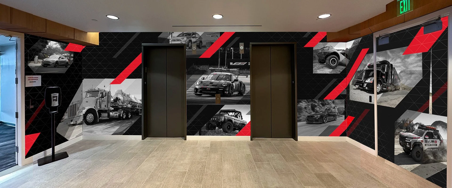
Entrance elevators
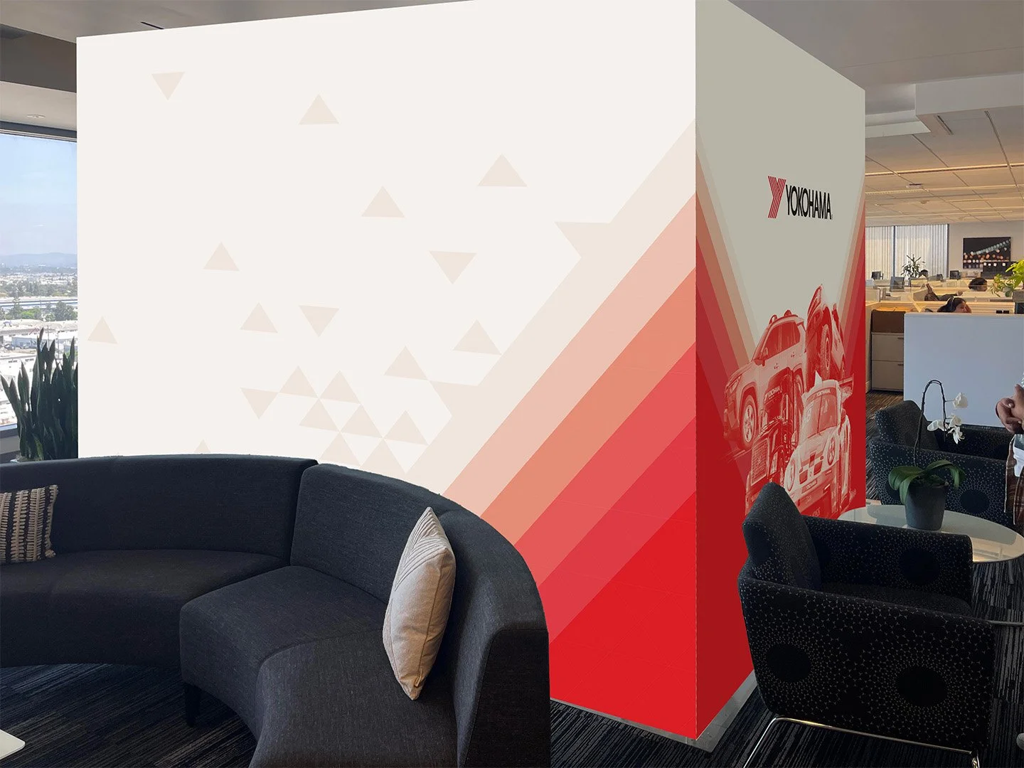
Reception wall and lobby pillar
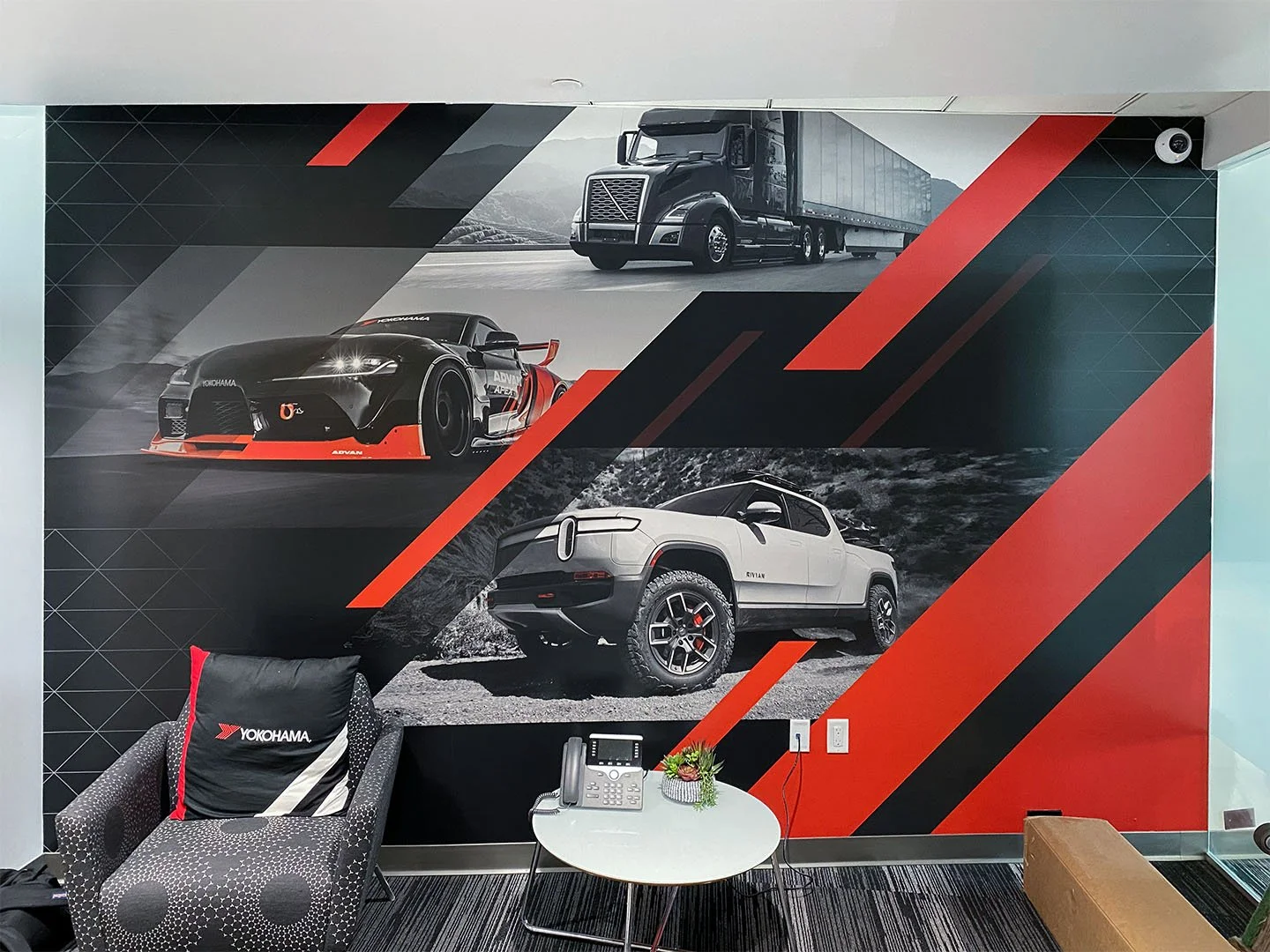
When a visitor first walks in, they are immersed in Yokohama Tire’s motorsport heritage. Images of performance vehicles, daily commuters, and utility beasts are enveloped by their signature red racing stripes.
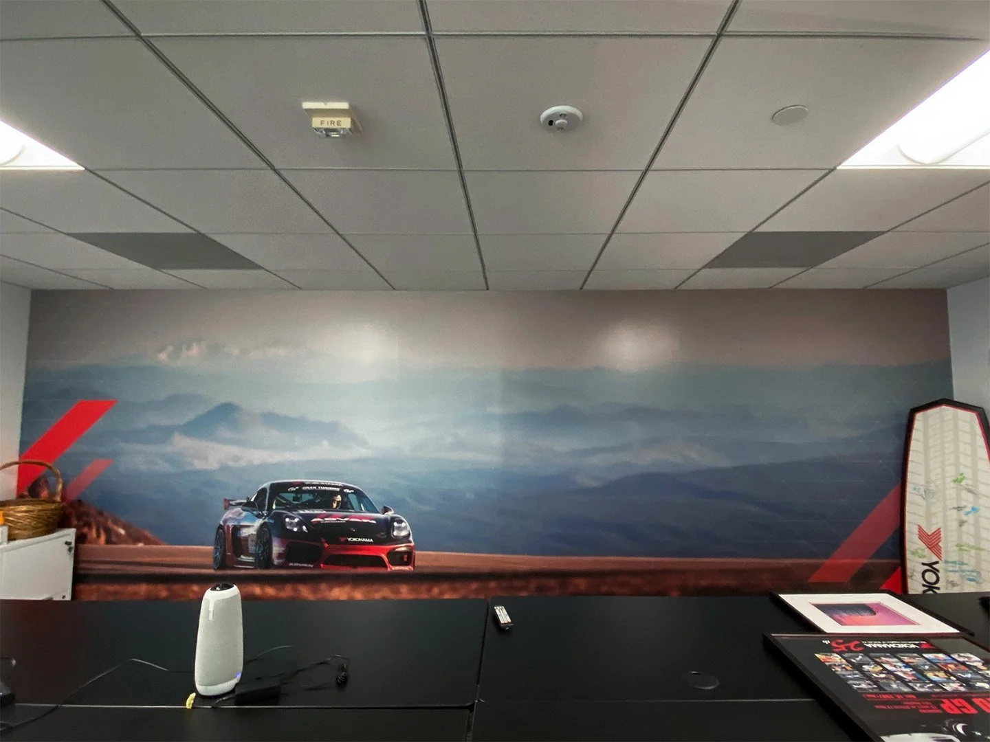
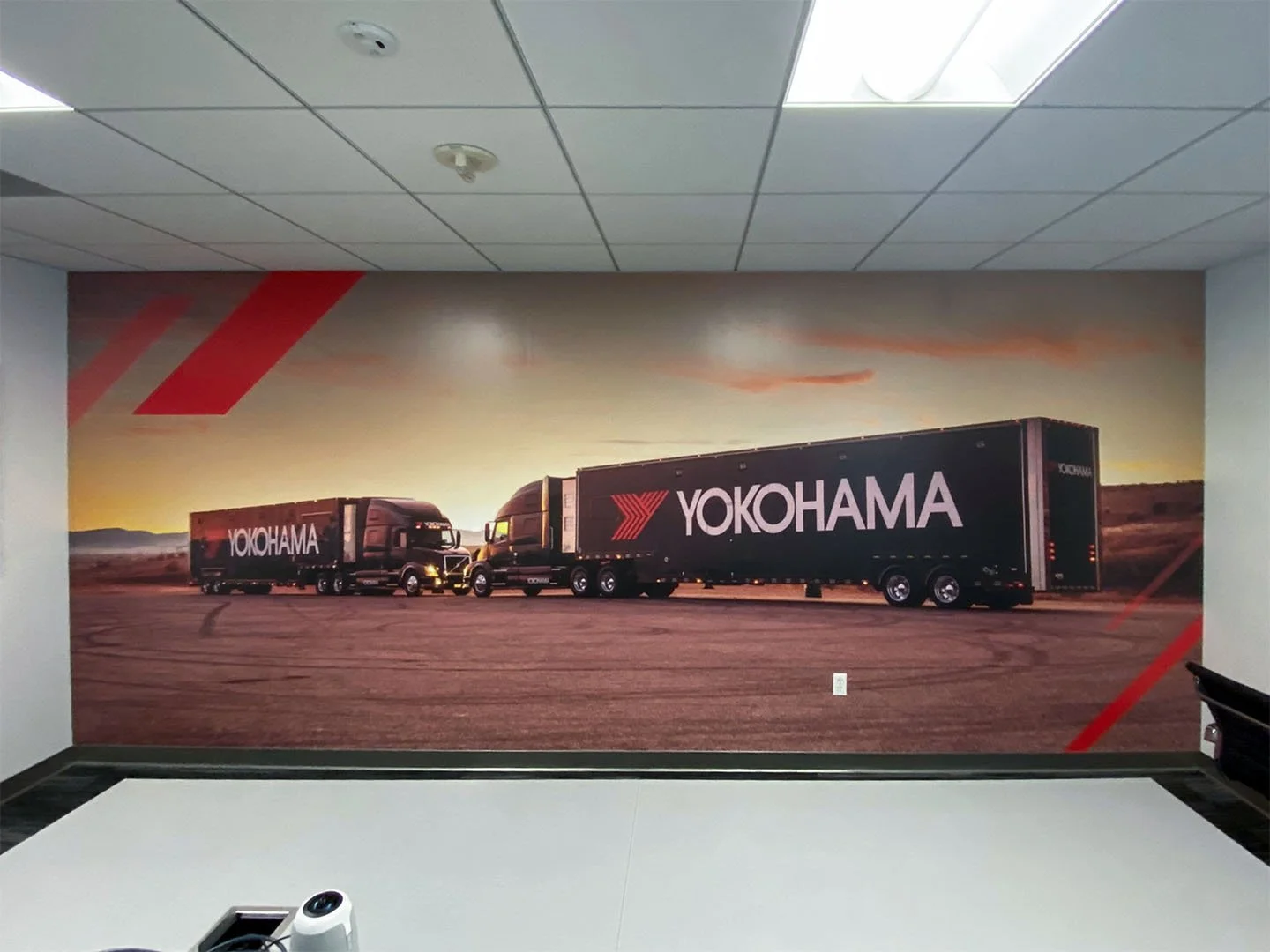
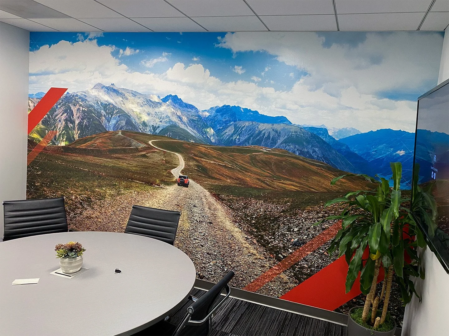
Meeting rooms
During calls and meetings, these conference rooms display one or two Yokohama-branded vehicles against a calm, open landscape.
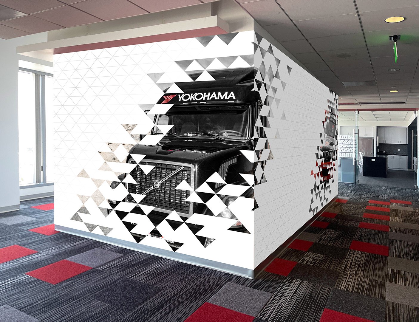
Lower level pillar
Inspired by the red stripe’s width, angle and shape, I’ve extracted a triangular grid for a fun breakthrough effect. It gives a sense of dynamacism and motion, while keeping the space bright and airy.
Agency: SweetSpot media
Role: Art Director/Designer